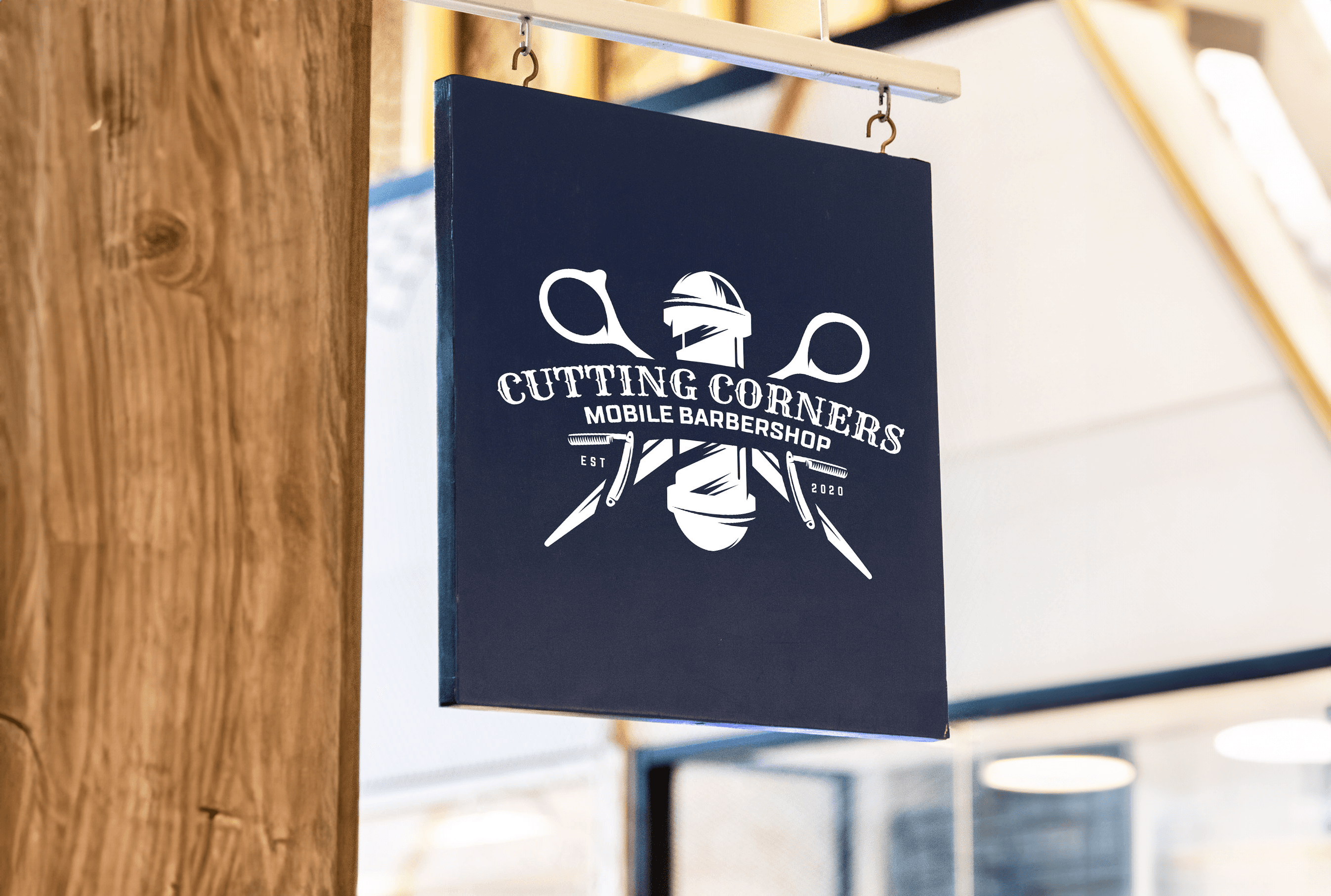
Year
2023
Client
Sebashian Sedor
Category
Logo Creation
Product Duration
4 Weeks
The brand was developed through market analysis of cannabis consumers seeking authentic, nature-inspired wellness products. We studied rustic aesthetics in boutique brands (like Beardbrand and Field & Supply) and identified demand for artisanal, small-batch cannabis with apothecary-style packaging. Surveys revealed 68% of Upstate NY buyers prioritize organic sourcing and nostalgic design. Competitive gaps included lack of heritage-positioned brands in local dispensaries. Pricing research informed our mid-premium strategy (25–25–60 range). Test groups responded strongly to our "farm-to-table" storytelling and matte-finish amber glass packaging.
Hempsterdam’s visual identity channels rustic Americana with hand-illustrated botanical labels, weathered typography, and matte amber glass apothecary packaging. Earth-toned palettes (forest greens, ochres) and raw material textures (kraft paper, hemp-twine accents) reinforce authenticity. Vintage stamp-inspired logos and farm ledger-inspired product copy complete the aesthetic—a tactile, back-to-basics approach for discerning cannabis traditionalists.
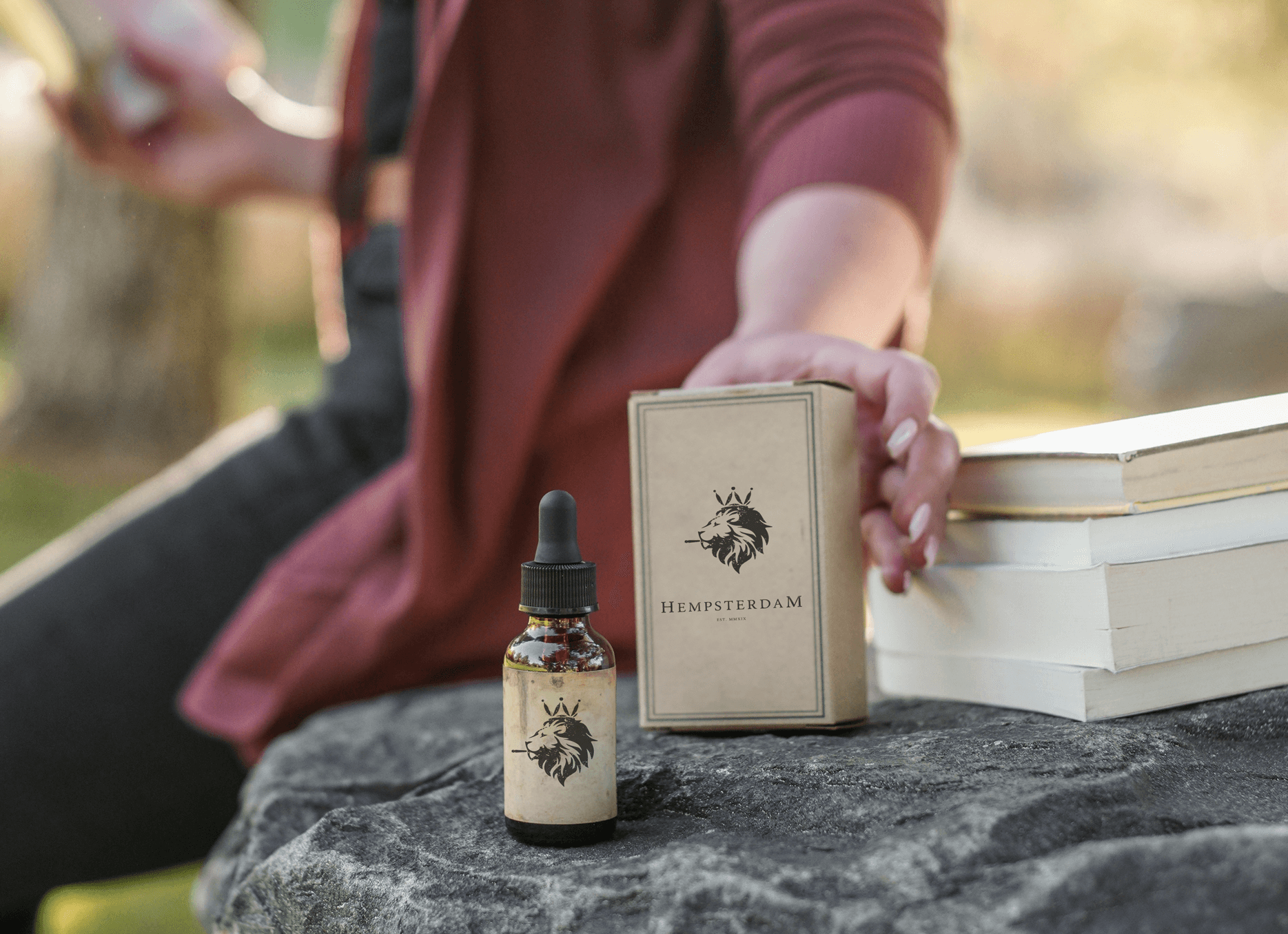
The brand was built through ethnographic research with Upstate growers, testing small-batch formulations with focus groups. We developed a vertically integrated supply chain partnering with organic hemp farms. The brand identity evolved from archival herbarium illustrations and 19th-century pharmacy aesthetics. Packaging underwent 12 iterations to balance rustic charm with regulatory compliance before our flagship launch.

Hempsterdam reimagines cannabis culture through a heritage lens—melding old-world apothecary traditions with modern organic farming. Our products celebrate slow craftsmanship, from hand-trimmed buds to small-batch extracts, presented in sustainable packaging that evokes 19th-century herbalism. This is cannabis as nature intended: uncomplicated, authentic, and rooted in Upstate NY’s agricultural legacy.